Basic Configuration
This guide covers the basic configuration of a 2D trend and the various properties which are necessary for its configuration. For more advanced implementation, please reference the provided property documentation and other user guides.
The authors of this guide have made the assumption that the reader has at minimum completed the Ignition Core Certification and as such the subject matter has been designed accordingly. Please use the Chart Properties page as a reference alongside this guide.
The primary properties which are required for a chart to display data are: data, axes, and pens. These properties are covered throughout this guide and are used as the building blocks for all chart development.
Chart Variants
After installing the SC Charts module, multiple chart variants are provided in the Ignition designer perspective component palette as described by the image below.
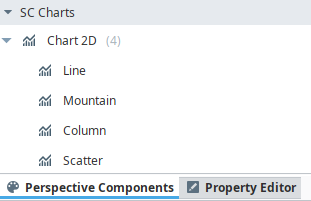
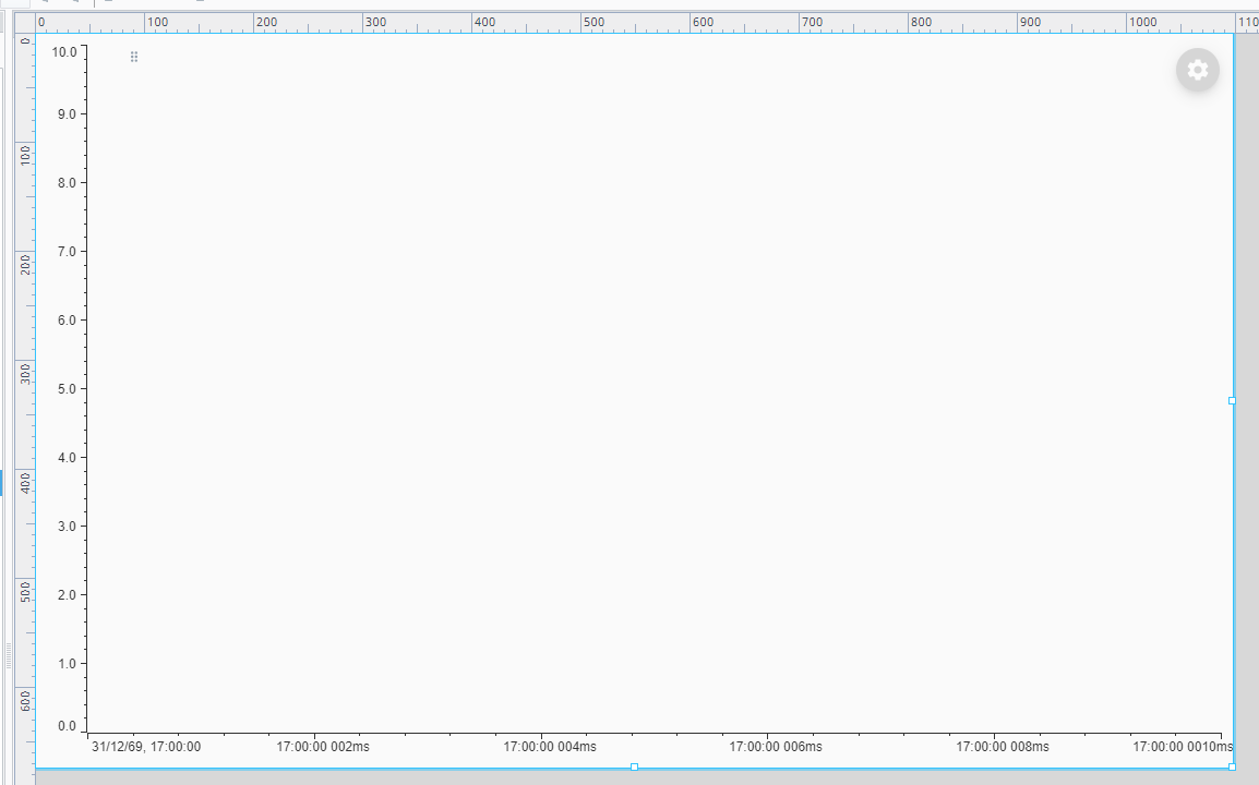
Each variant, similar to the timeseries chart component variants, provide some basic configuration for specific chart types. This guide utilizes the basic Chart 2D variant as its base. Once the basic variant is placed in the designer view, the chart should resemble the following example:
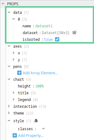
Data
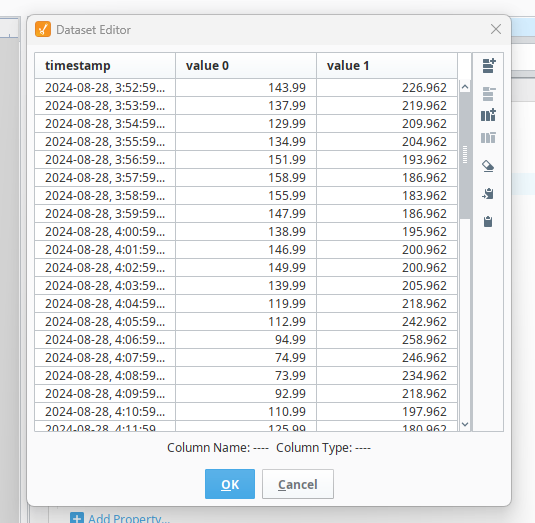
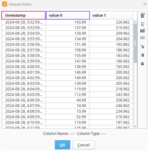
Data is defined under the data property. The data object must include a unique name, a dataset, and must set a flag for whether or not the dataset is sorted in the x-direction. The method in which the dataset property is defined is developer dependant. For this guide, the dataset has been hardcoded (it is actually the dataset from the line variant copied and pasted into the basic variant) but may be bound using property bindings or written using other scripting methods. See the images below and note the naming of each of your dataset columns as they are used throughout this guide.
Pens
As previously stated, the primary properties for displaying a basic trend are data, axes, and pens. With data now defined, and the default component providing a basic x and y axis, a pen should be defined to display the trend.
Add an array element to the pens array. The pen will contain some default values and the designer will display a few warnings. This is to ensure the user fills in all required pen fields to display their trend. See the image below.
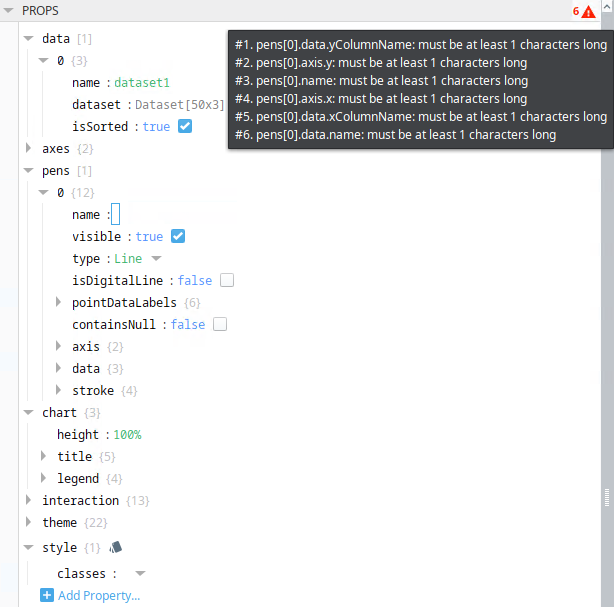
To resolve the warnings, the user must provide values for the pen properties listed in the warnings.
The primary pen properties which are mandatory are listed below.
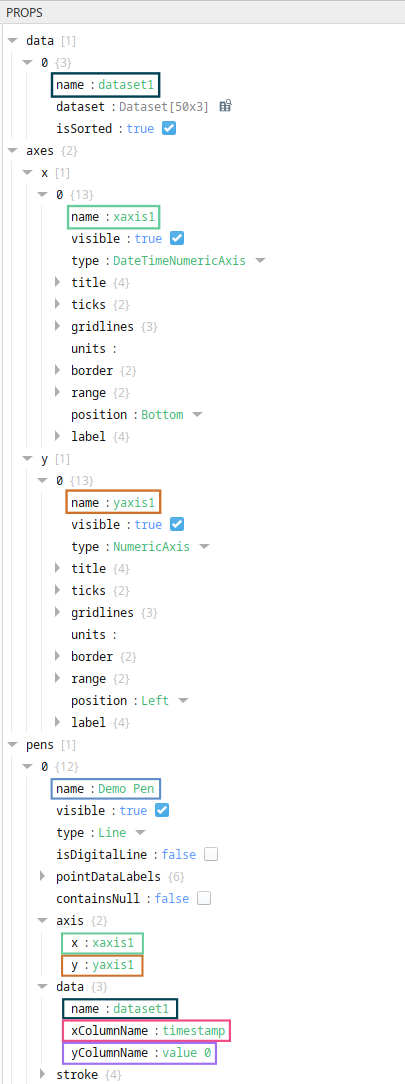
name
The pen name property is a string and is used to uniquely identify the pen. This name is used within the built-in legend.
axis
The pen axis object defines the x and y axes on which the pen will be drawn. Use the axis.name property value for the respective x and y axes here.
data
The pen data.name property defines the name of the dataset, this is required alongside the data.xColumnName property which defines the name of the column in the dataset which represents the x axis, and the data.yColumnName property which defines the name of the column in the dataset which represents the y axis.
See the images below which depict the corelation between data, axes and pens.
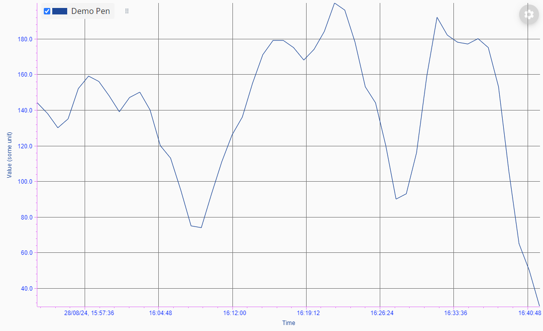
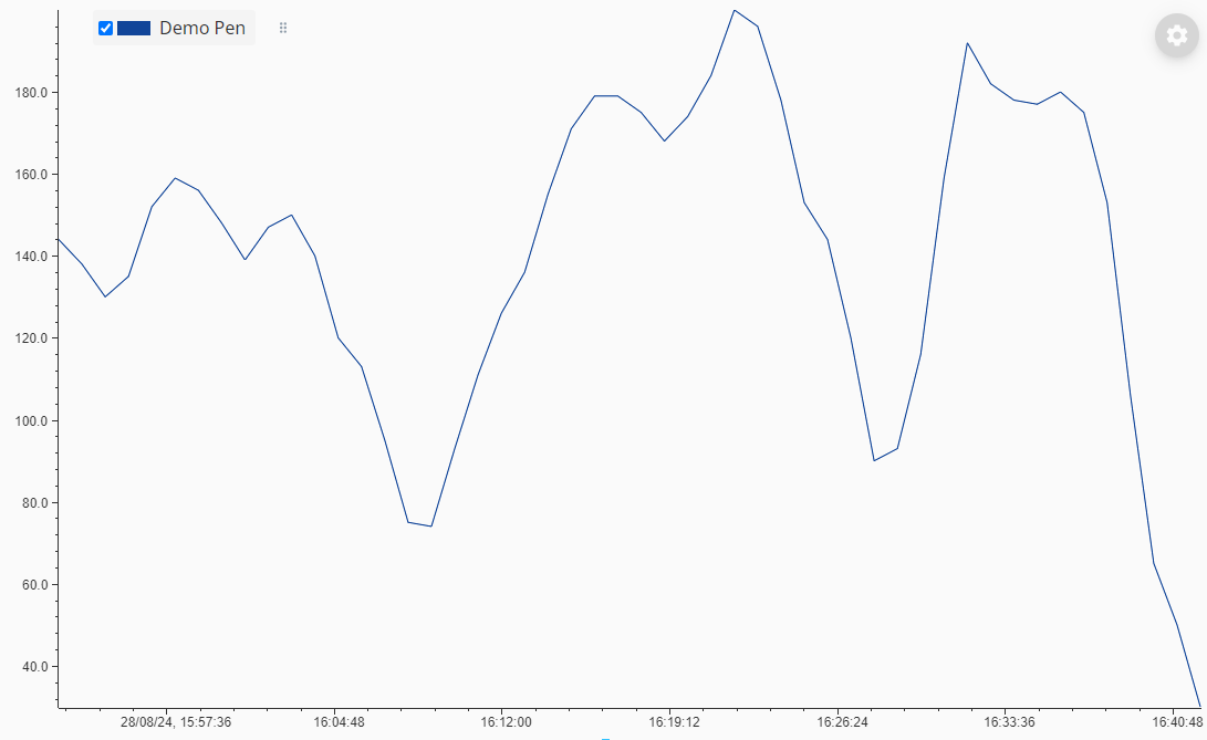
When a pen is configured correctly, the data should be rendered in the charting area as pictured below.
Output may vary depending on data.
As the pen stroke color is not explicitly defined by default, the color will fallback to the theme.penLineStroke theme property. To explicitly set a pen color for each pen, use the pen stroke property.
Customizing Axes
The axes' names, colors, gridline spacing, and more are customized through the axes properties. In this guide, we will cover adding titles, gridlines, and changing colors.
Axis Title
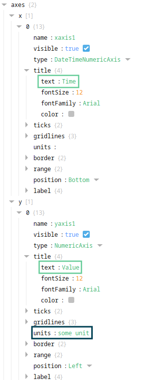
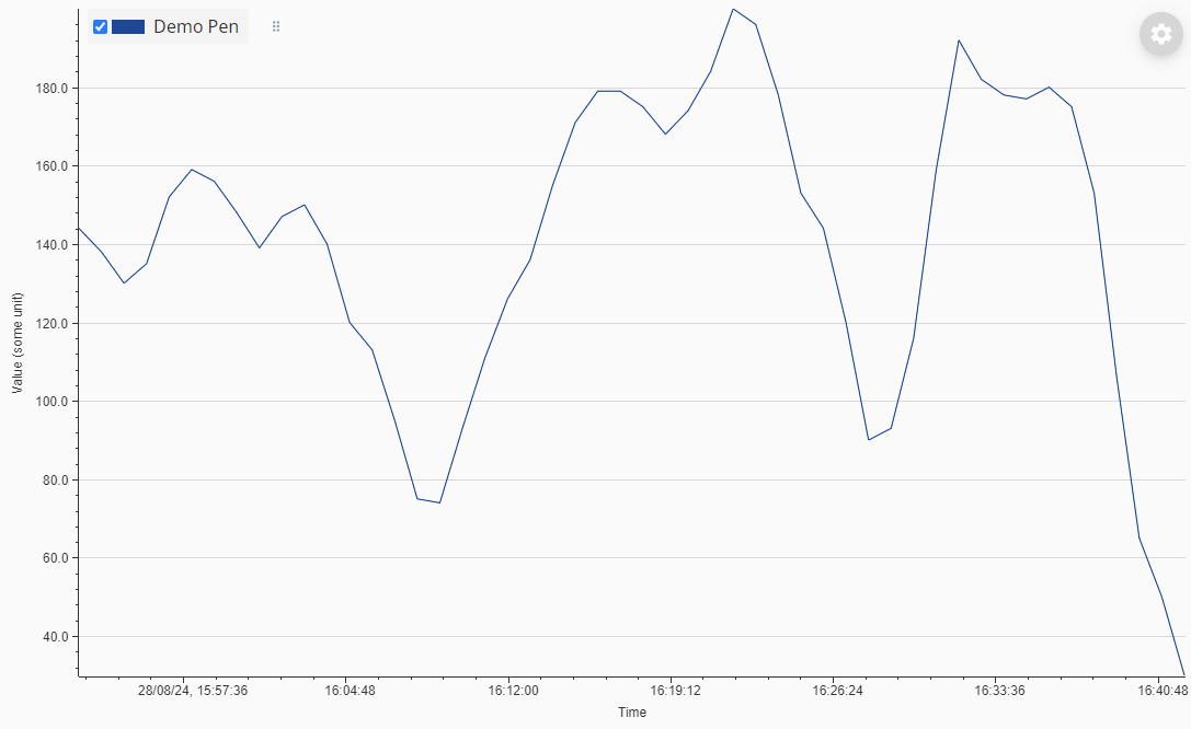
Add a title to the x and y axes respectively by editing the title.text property, units may be defined optionally by providing a value to the units property or may be defined on the title.text property manually. See the images below which depict title properties and their resulting chart.

Axis Gridlines
For simplicity, we will start with adding major gridlines to the y-axis. Set the gridlines.major.visible axis property to true to display major gridlines for a single axis.
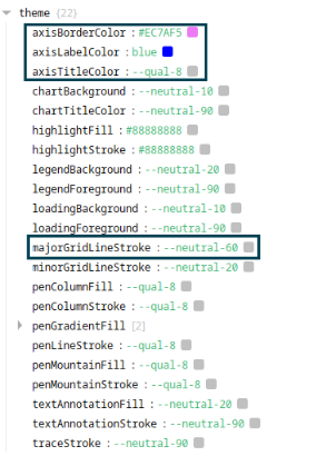
As the major gridline color is not explicitly defined by default, the major gridlines color will fallback to the theme.majorGridLineStroke theme property.
See the image below which depicts the major gridlines using the default color scheme.
Axis Colors
There are multiple properties in which colors may be defined. The simplest customization is through the theme properties as this reduces the need to set colors on each axis separately.
Set the theme property for axisBorderColor, axisLabelColor, and axisTitleColor to a CSS variable or simply a HEX color (see the color documentation for more information on color properties) to set colors for all axes borders, labels and titles respectively.
Gridline Colors
Set the theme property for majorGridLineStroke. See the images below for results.